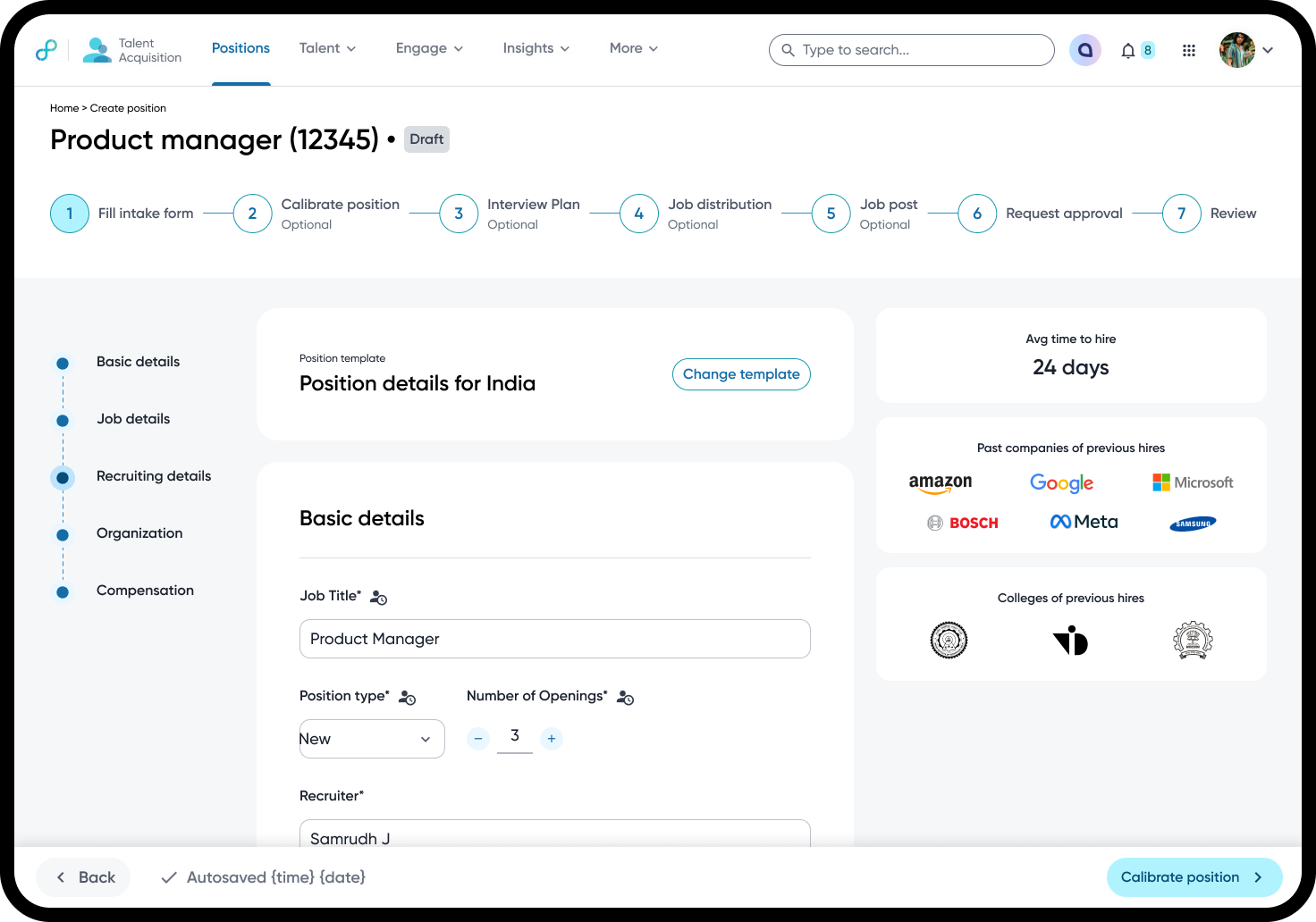
Cutting train booking from eight steps to three
Credits
Me · design consultant, end-to-end flow and review screen 1 product designer 2 product managers 4 engineers Content design Markets: UK and Spain, with Eurostar explored
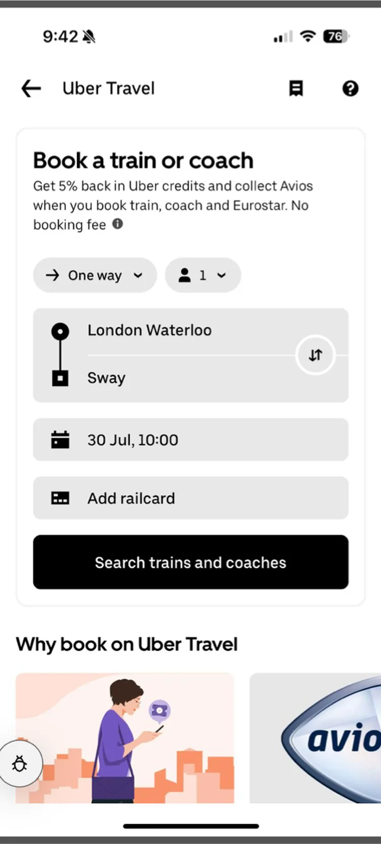
Executive Summary
__tr_exec__
01
Context & Overview
The Product
- Ticket|Train and coach tickets inside the Uber app
- Coins|Uber credits on every ticket
- Handshake|A booking partner supplies fares in the UK and Spain
The Users
UK commuter
Books same-day round trips, often within an hour of departure Mostly commuters, so best-value fares add up Need - speed, smart defaults and the shortest path to pay
Spain leisure traveller
Books one-way leisure trips about five days ahead, often monthly Price-sensitive and flexible on dates and times Need - room to compare fares and conditions; add-ons like seats matter
Who’s involved
__tr_who__
Customer Goal
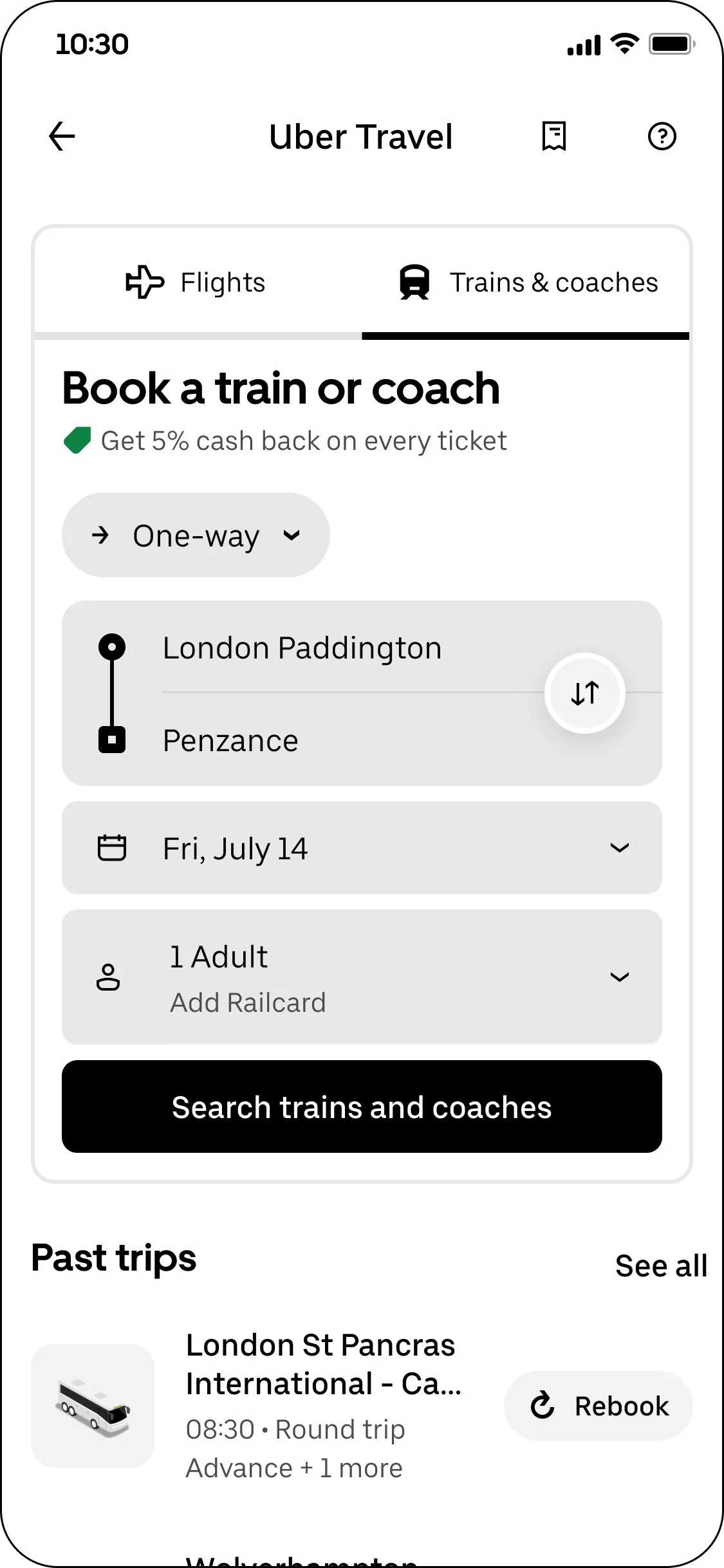
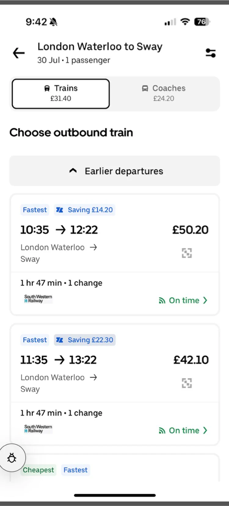
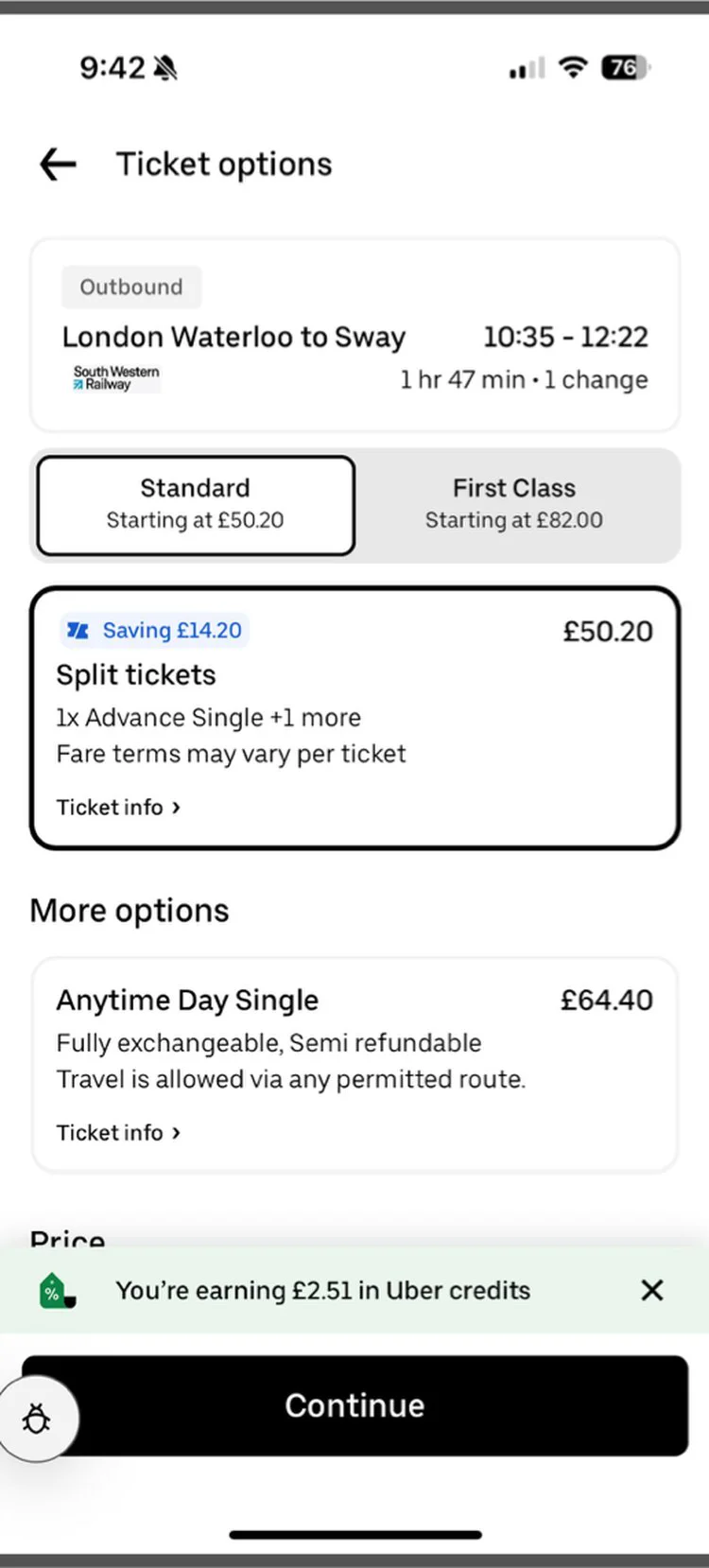
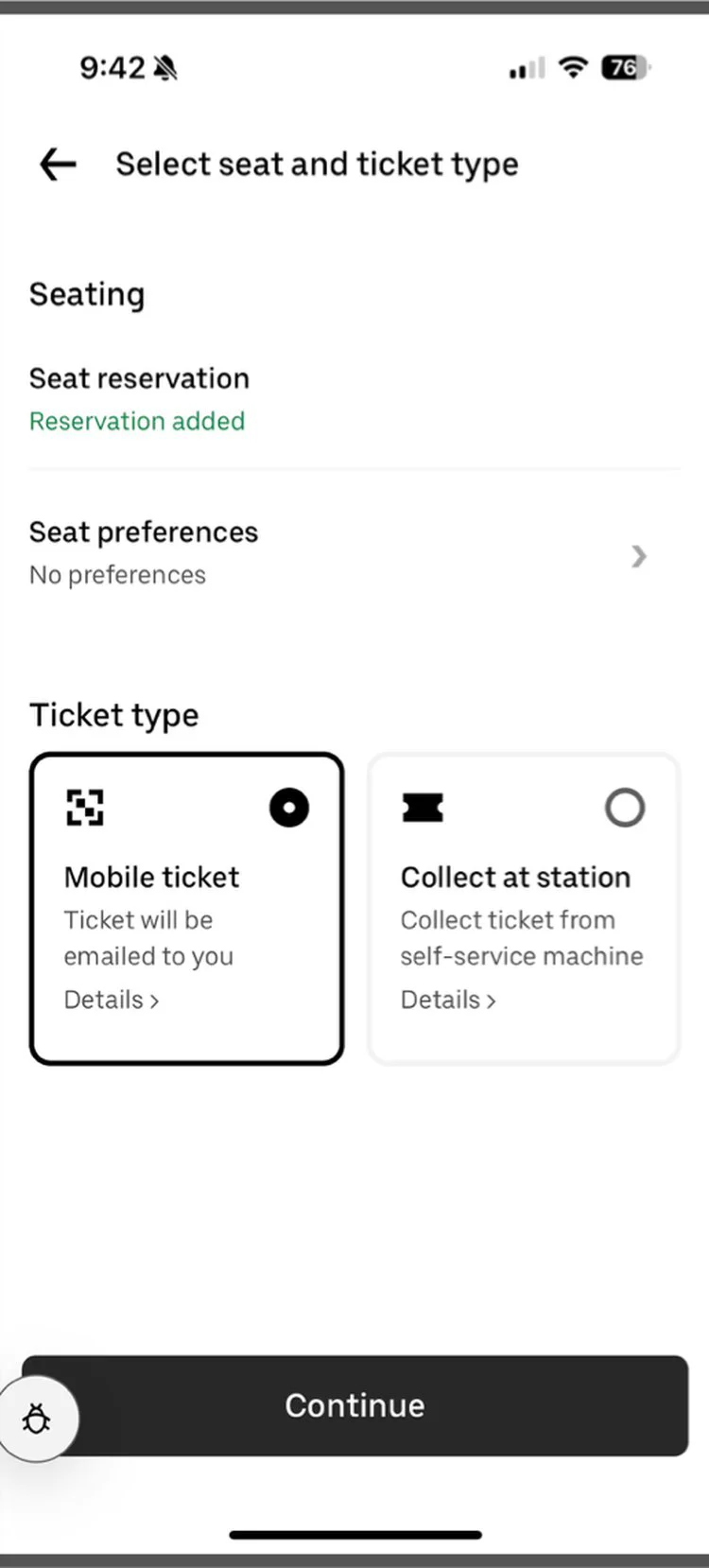
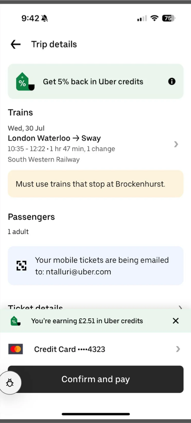
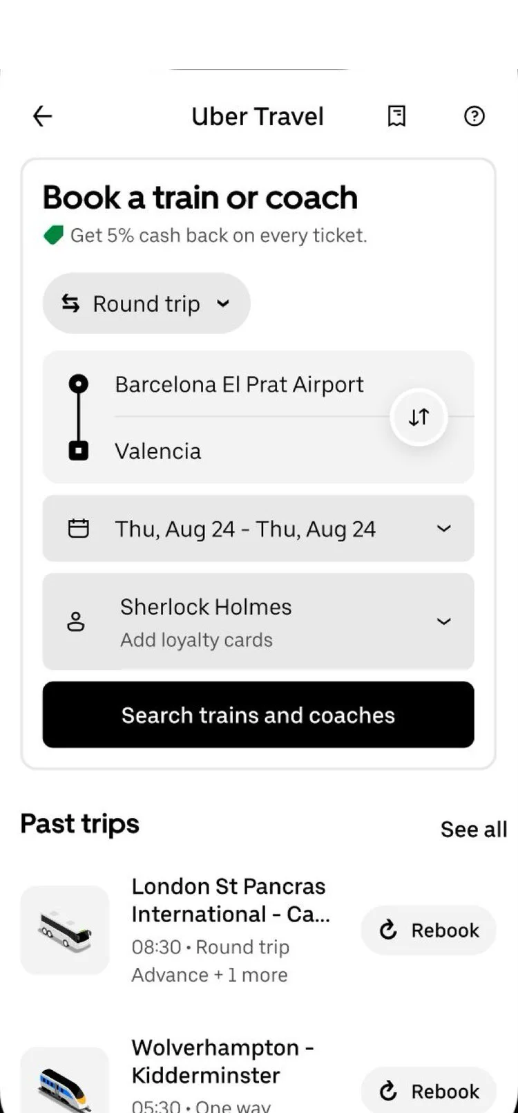
Get to the next train in three screens.
- Timer|Fewer screens · six down to three on the fastest path
- Tags|Price up front · total and “Cheapest” flag first
- PenLine|Nothing locked · every default editable on review
Business Goal
Turn more searches into bookings.
<1 in 10
visitors who opened Trains finished a booking
~⅓
left after seeing results
~⅓
left after choosing a route
1 in 10
left on the final screen
02
Problem Definition
The Problem
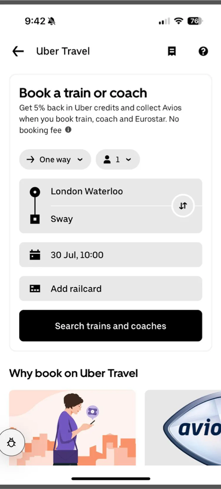
- ListOrdered|Eight steps before paying · in the UK
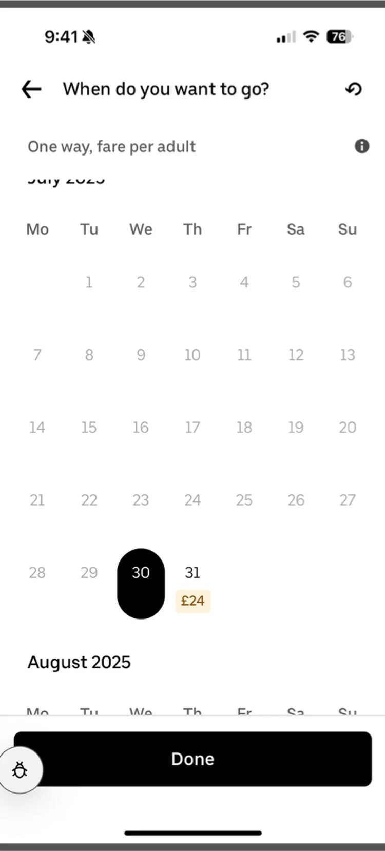
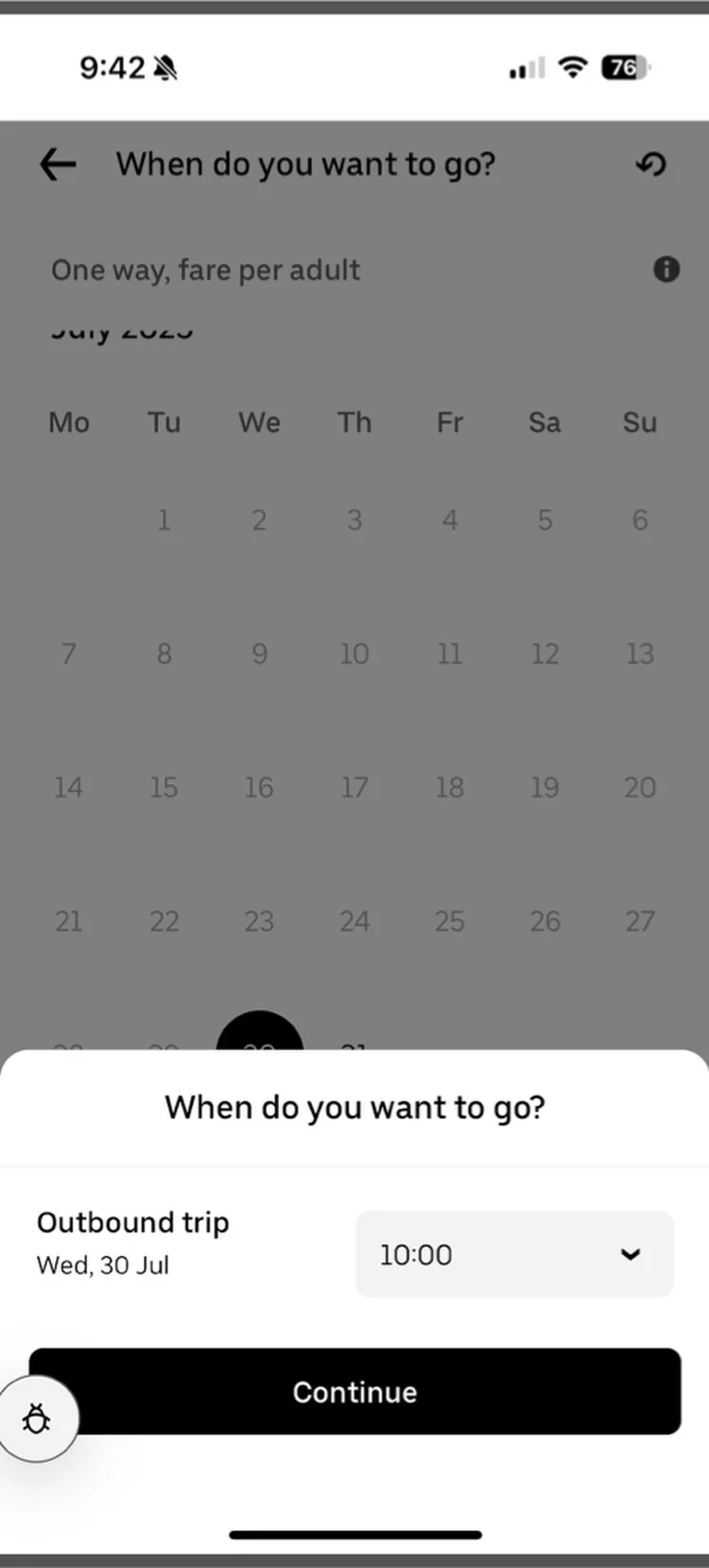
- Repeat|Search entered twice · date, time, then again
- Armchair|Ticket and seat screens · even with nothing to pick
- Globe|Spain matched rivals’ screens · not their add-ons
- Smile|Riders were satisfied · the funnel still leaked
What riders said
- Route|Hard to find a route · half said average or worse
- Ticket|Ticket types confuse · about half said so
- FileText|Fare rules hide · several taps to read them
- Zap|Speed asks · a “now” option and saved journeys
__tr_more_research__
Design Question
How might we simplify the Uber Trains booking flow to drive higher conversion?
03
Design Principles
Principles
__tr_principles__
A
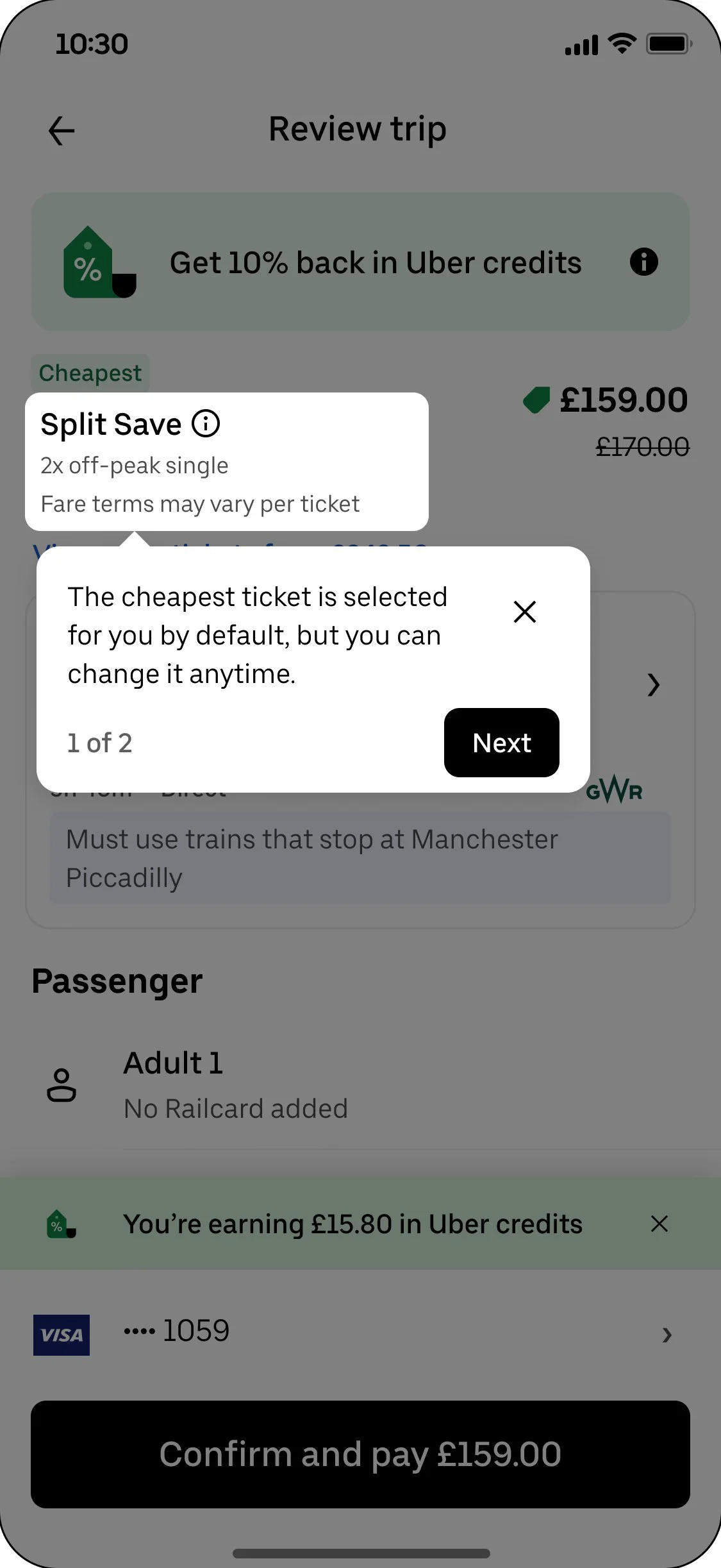
Default to the likely choice
What changed
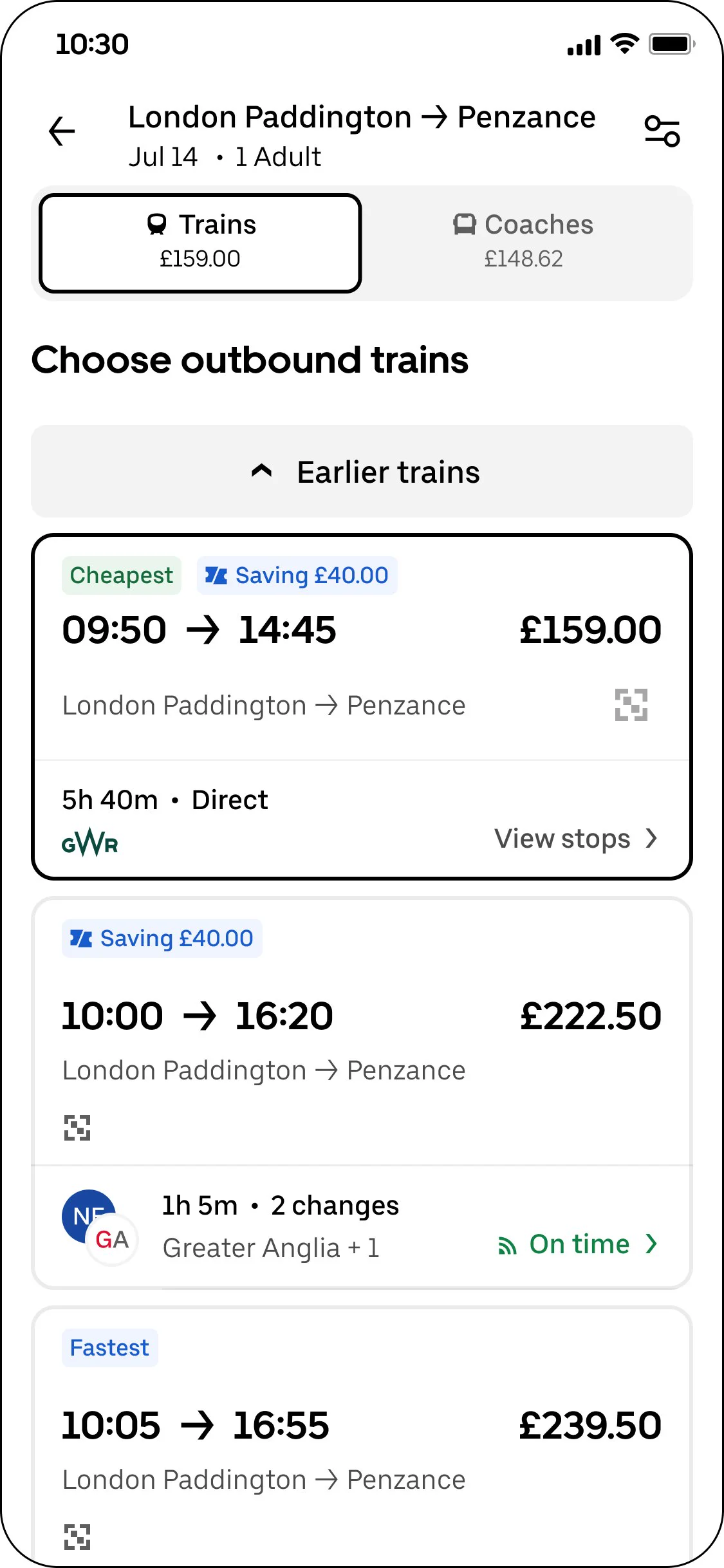
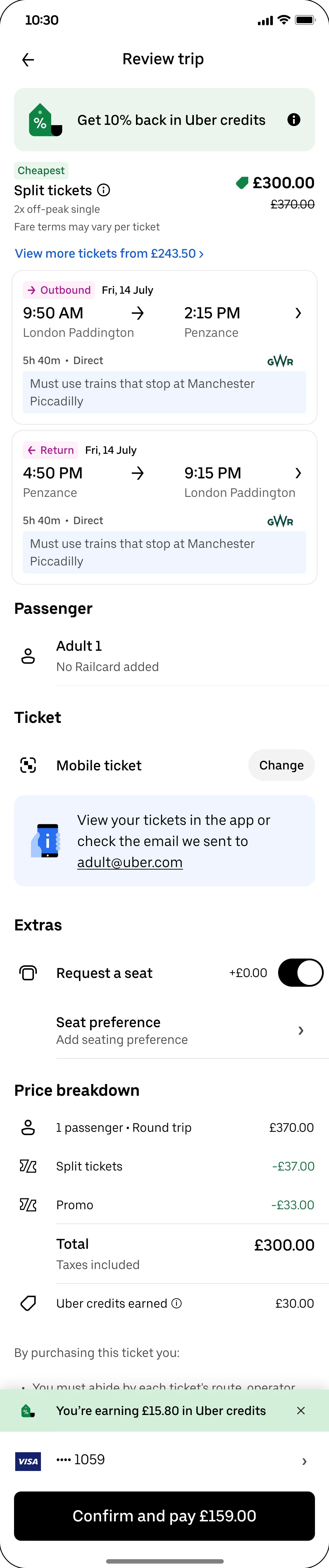
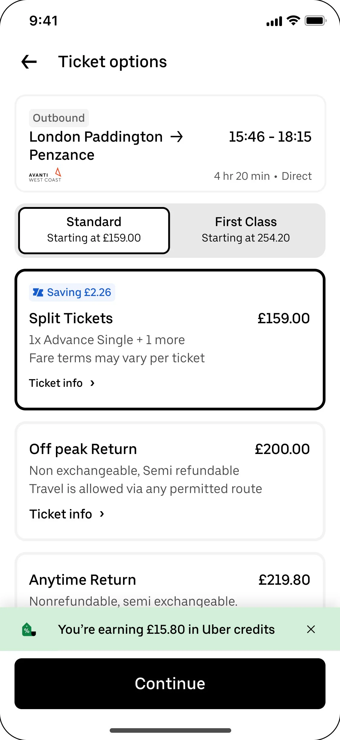
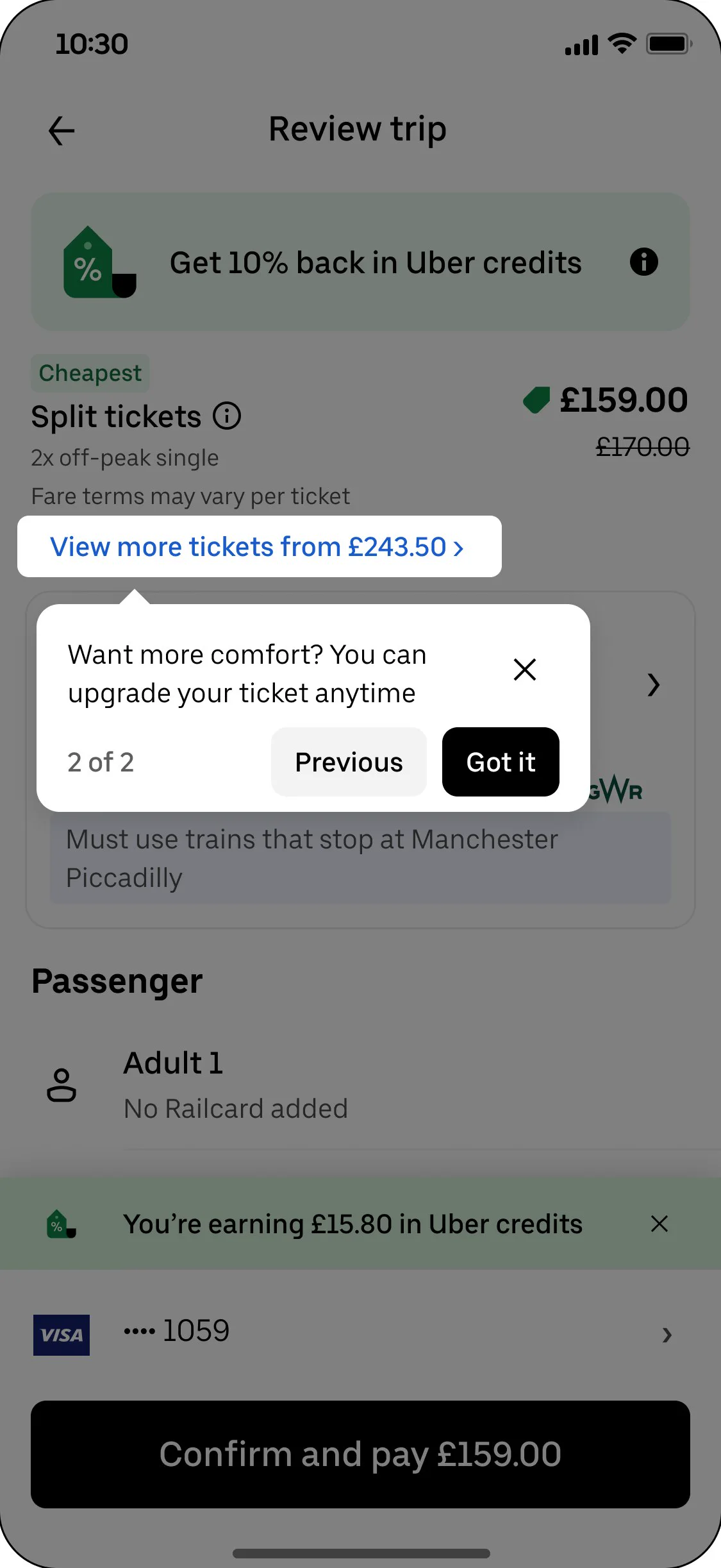
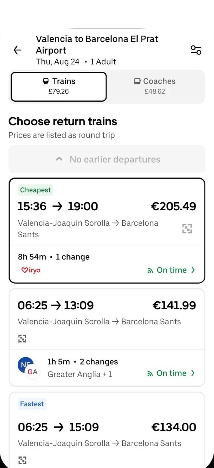
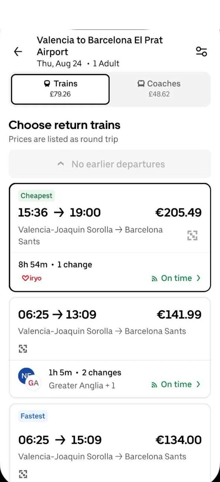
- Tags|Cheapest fare preselected · flagged “Cheapest”
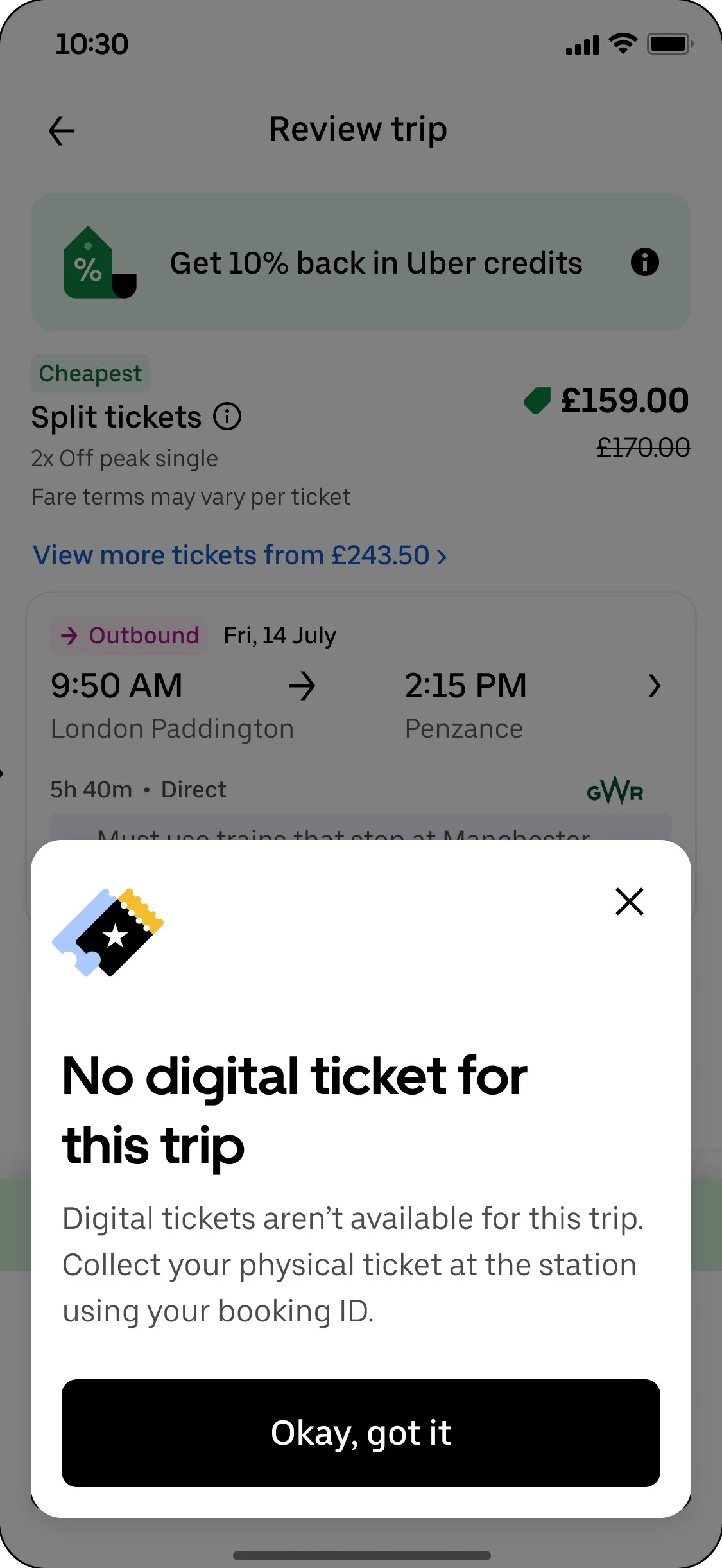
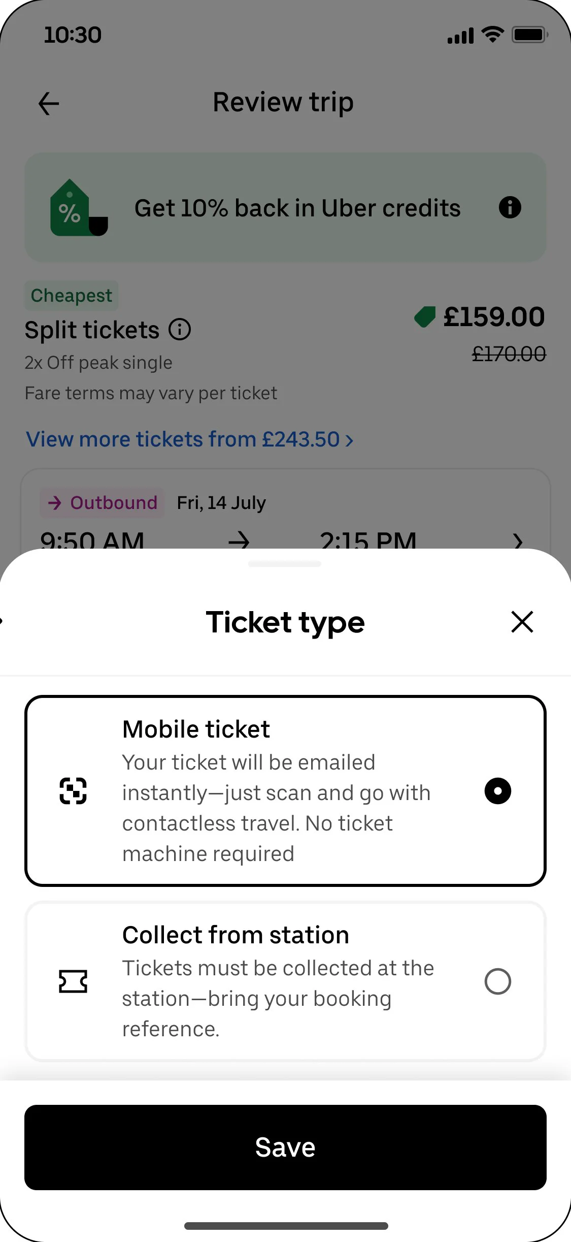
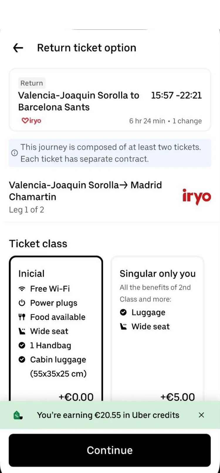
- Ticket|E-ticket chosen · whenever one exists
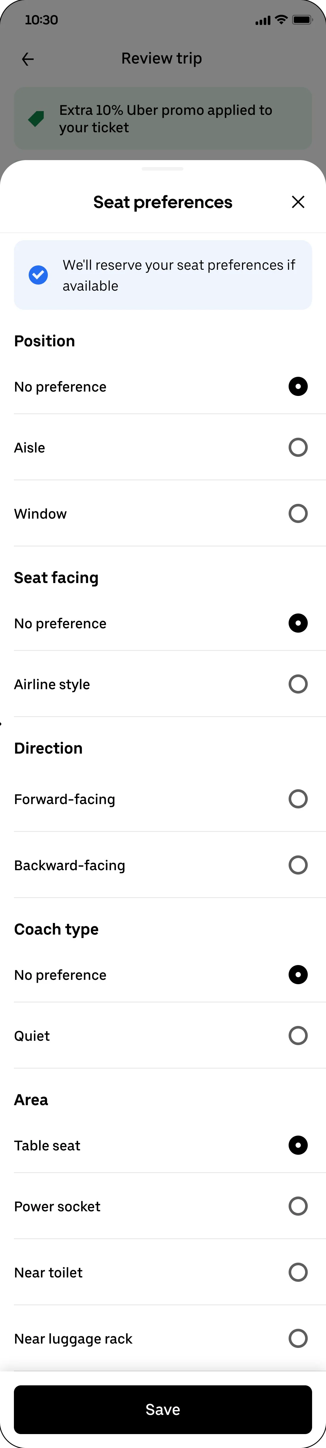
- Armchair|Saved seat preference · reused automatically
- PenLine|Every default editable · on the review screen
__tr_more_a__
B
Show what you’re buying before you pay
What changed
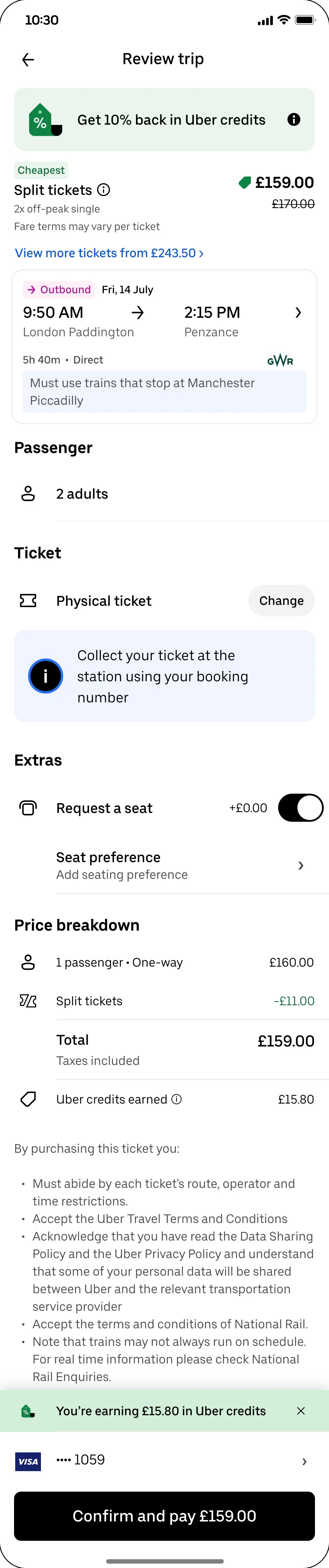
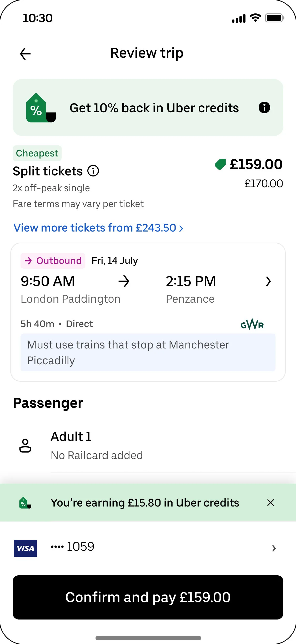
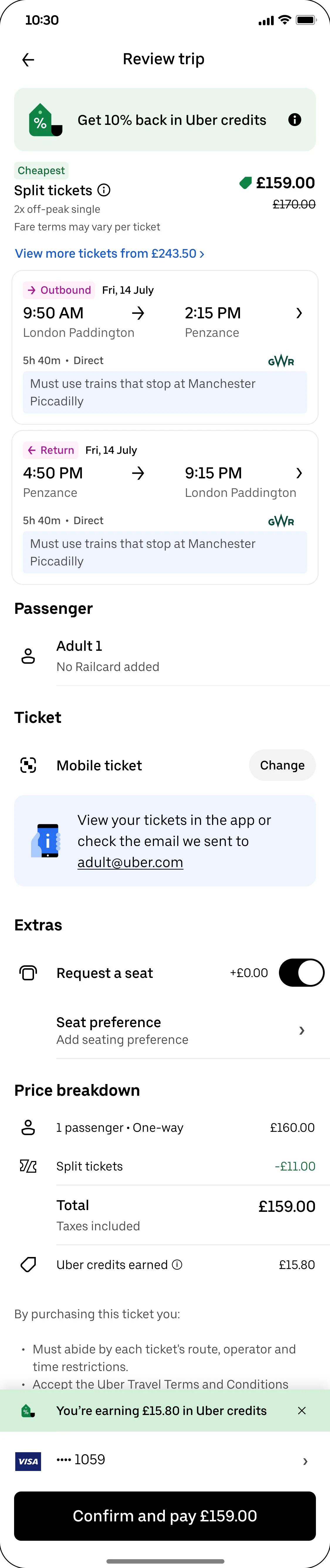
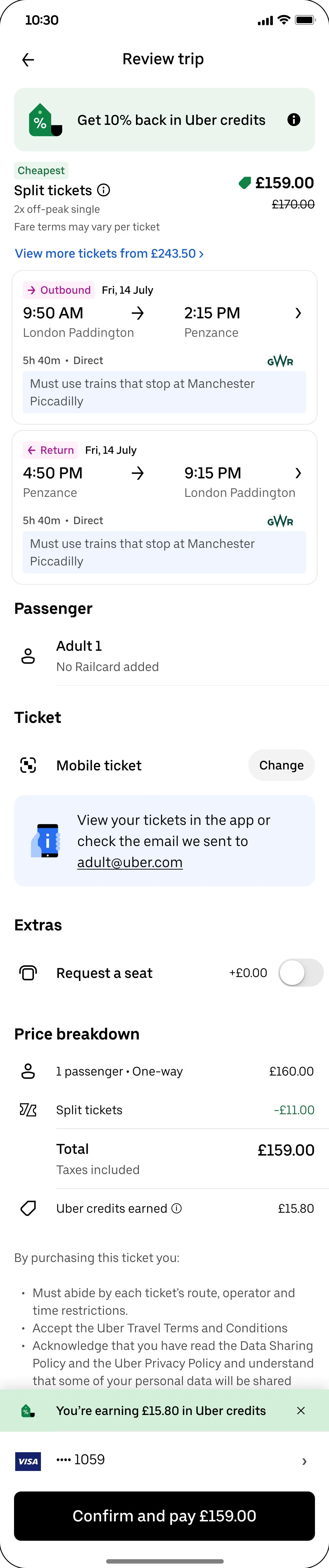
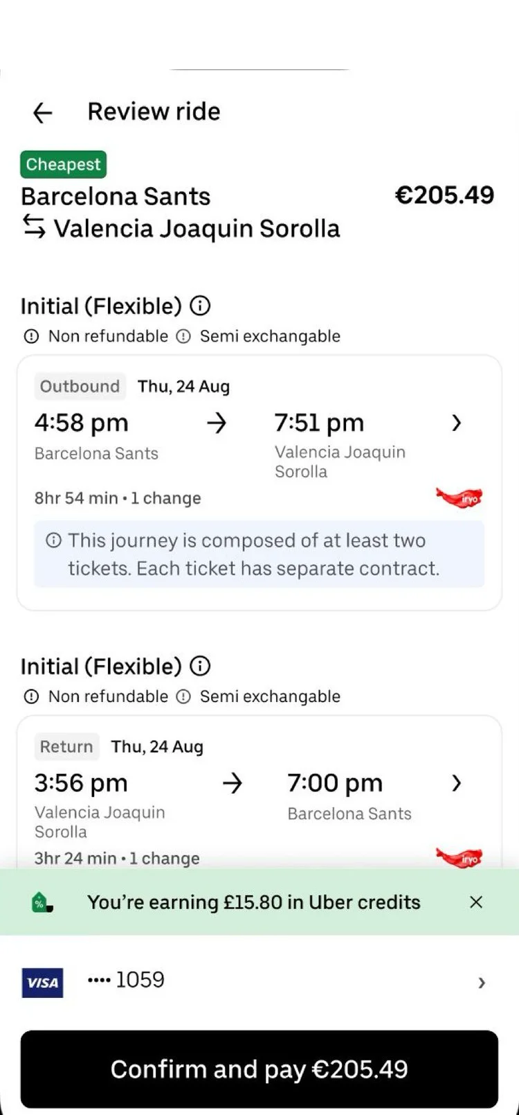
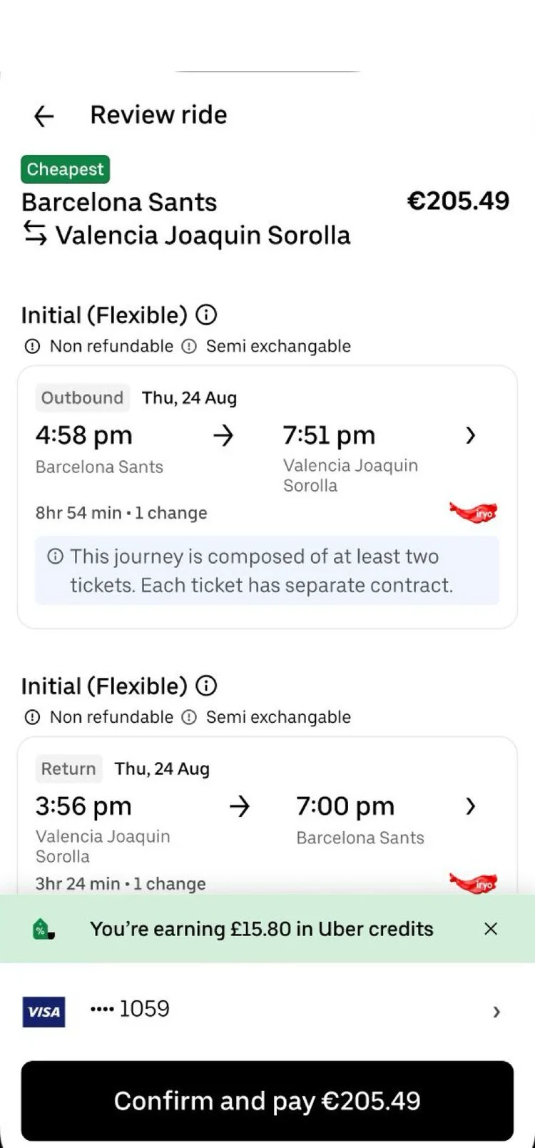
- LayoutTemplate|Overview first · route, total, “Cheapest” flag
- Route|Journey card · times, changes, operator, rules
- ArrowUpRight|Upgrade, not hunt · “View more tickets from £243.50”
- Ticket|Ticket and Extras · delivery and seat, editable
- CreditCard|Sticky footer · credits earned, “Confirm and pay”
__tr_more_b__
C
Touch only the path to purchase
What changed
- Ban|No changes to railcards · post-booking or calendar
- Globe|One flow for every market · UK behaviour as default
- Database|Screens come back · only when data supports them
Options we weighed
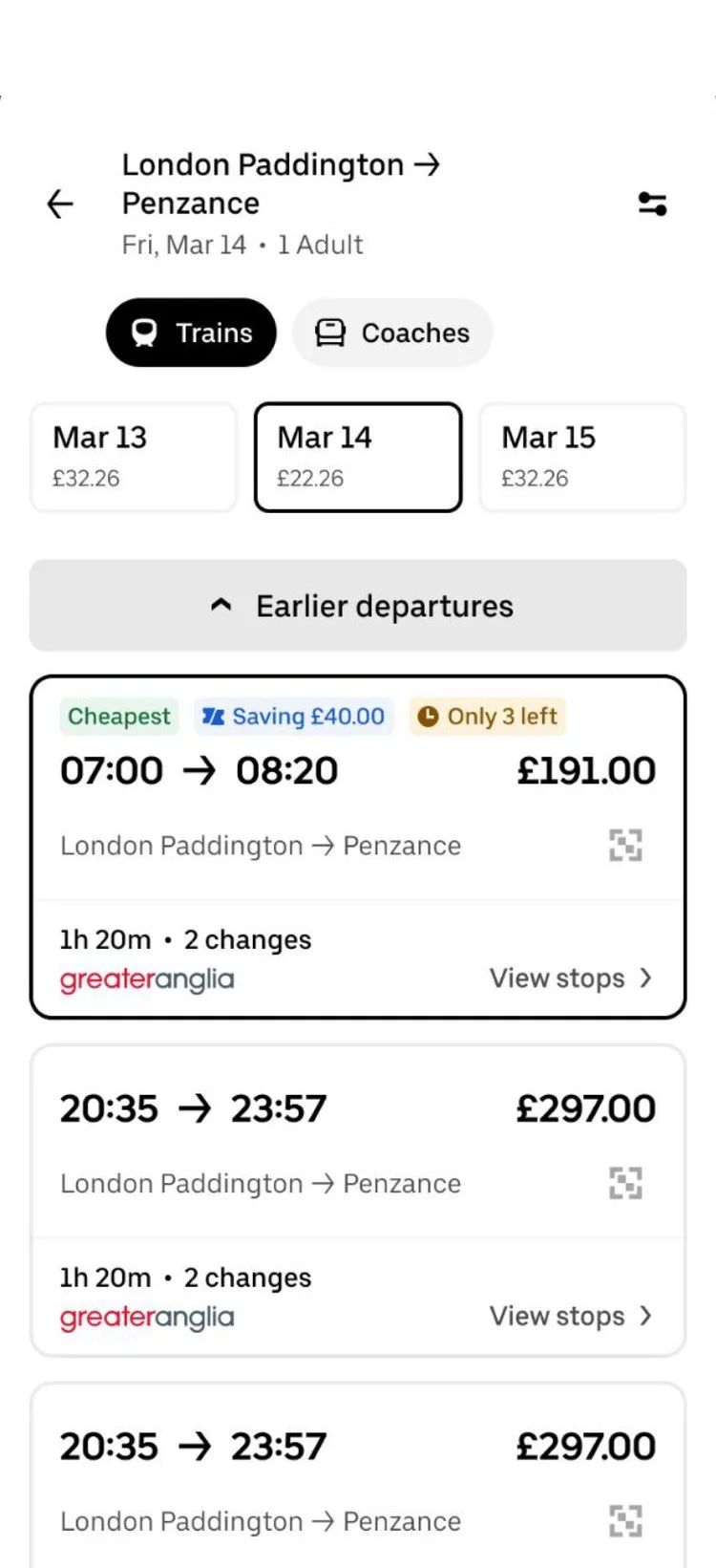
- Calendar|Nearby-date fares · dropped after the CP2 review
Decision log
Default the cheapest fare
Options · always ask, default cheapest, default last-used Chose · cheapest, flagged “Cheapest”, editable on review Trade-off · some riders may miss better-value upgrades
Skip ticket and seat screens
Options · keep both, merge into one, move to review Chose · move to review as editable rows Trade-off · review screen carries more information
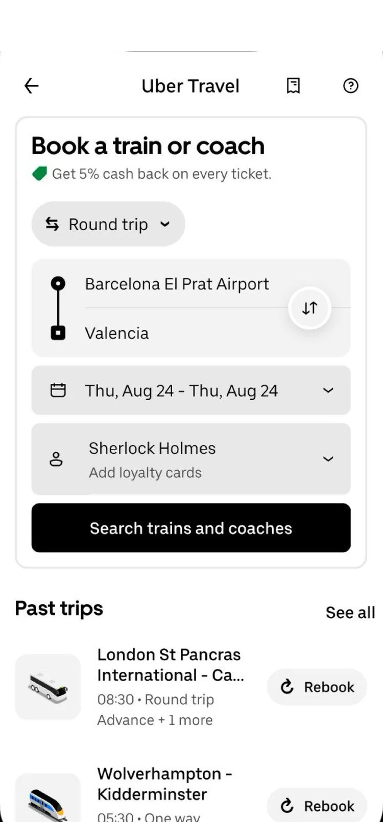
Keep Spain’s longer flow
Options · Spain A (current + better review), Spain B (short) Chose · A; class and fare detail mattered more Trade-off · Spain keeps more steps than the UK
__tr_more_decisions__
04
Validation
CP2 feedback
- Tags|“Was the cheapest chosen?” · flag and first-time tips
- CreditCard|“Where’s the total?” · fare moved to the top
- Calendar|“Nearby dates add little” · journey left as it was
__tr_more_cp2__
Hallway test
3.8
UK riders · UK short flow
4.5
Spain riders · UK short flow
- Users|Six frequent riders · three UK, three Spain
- Gauge|Shorter felt easier · but less certain
- Search|Open returns and seats · harder to spot
Decision
Short flow for the UK. A better long flow for Spain.
- Scale|Spain scored both options 4.2 · UK riders preferred A
- Compass|Leisure riders compare fares · hiding detail was the risk
- CircleCheck|Pre-CP3 review · A for Spain, short flow for the UK
05
Handoff
Timeline
- Calendar|Week 1 · CP2 review
- Calendar|Week 5 · prototype test and Pre-CP3 decision
- Calendar|Week 11 · scope narrowed to the UK
- CalendarCheck|Week 11 · final handoff, UK flow shipped
__tr_more_timeline__
What I would measure
- Gauge|Search → Trip Summary conversion
- Timer|Time to book
- PenLine|How often riders change a default
- Headset|Support contacts per 1,000 bookings
06
Reflection
What I learned
- UserX|Power users hid first-time pain · all six knew the app
- Globe|One flow didn’t fit two markets · Spain needed detail
- LifeBuoy|Defaults need a safety net · tips and editable rows
- Target|Next · test the review screen with first-time riders